Post move we've developed a list of items to be on the lookout for- mostly boring baby or home related things. Things that we can get now that we have closets, a yard and an actual dining room.
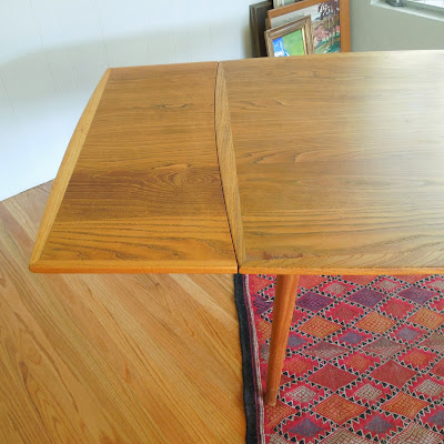
Yesterday I brought home a dining table and 4 chairs. In someone else's house I loved them so much that my first instinct was to lick them to claim them as mine forever and ever. However, in my house I'm having a problem making them fit.
Look past the awkwardly placed rug and piles of artwork waiting to be hung. It really is a gorgeous set but doesn't quite go with our hutch or at least the current placement of our hutch. For one the hutch is a much more substantial piece and the wood is blonder. When the table is centered under the light there is not much room between the table and the hutch.
The table has leaves that slide out or under. We could leave it square but I think it does nothing for the room or table to leave it all closed up.
I love the shape of the chairs. Since the current covers are not original and the foam is nice but a bit thick I've already started the process to remove and recover. There are no marking on the table or the chairs except for written on the underside of the table "IMP-51" A Mid Century group on Facebook threw out the name Koefoeds Hornslet and these chairs are a close match, just not marked and the wood looks to be oak, not teak or rosewood.
So my question is...Does the table work in this room? Do I keep the table and chairs and try to rehome the hutch. Or do I sell the set and look for one better suited for this space?
*UPDATE* new post HERE with pictures of the entire room and the table flipped around.
Love seeing what others find? Be sure to check out, Nifty Thrifty, Sir Thrift a Lot and Remnant


I love the table and chairs. I am thinking the table needs to be swung around. Set in the same direction as the hutch. And it is not hard to move the ceiling light. And recenter it a foot or so down.
ReplyDeleteAnd I suspect that Mr. Modtomic might be able to give you direction, about the maker of the table and chairs. He loves this time period....
http://mistermodtomic.blogspot.com/
Thanks for the suggestion. My husband agrees with you and thinks we should try to turn the table in the opposite direction.
DeleteWhat you can't tell from any of these photos is that the dinning area is part of a much larger great room and in my mind I feel that turning the table would visually disrupt the room. I'm going to try it though and take a few pictures to post tomorrow.
Lovely table set! Hope you keep it.
ReplyDeleteIt's hard to tell what else is in the room from your pictures, but I'd be tempted to put that hutch on the bare wall shown in photo #1, and then turn the table as FGP suggests. It might give focus to the table, balance the 'weight' of the furniture, and might integrate with the rest of the room.
I like that idea! We've already rotated the table per FGP's suggestion and it's working for the most part but something still feels a little cluttered yet empty. I think you are spot off with the suggestion of moving the hutch to the empty wall. Pictures to follow.
ReplyDeleteRehome the hutch! I would lick that dining set too ;)
ReplyDeleteHa Ha. I'm leaning more to that idea myself. (about rehoming the hutch...not licking the table)
DeleteIt's a very gorgeous table and chairs. Actually, I think it looks just fine where it is!
ReplyDeleteThanks. I might agree with you. I tend to forget that I usually need to live with something for a few days before I make any rash choices. I don't do well with change. :)
DeleteI think it looks good where it is too. AND I like the rug like that. It pulls your eye right over to your buffet makes the area look bigger. Ok so I think what might be bothering you is you got a big window and a big blank wall. I'm betting if you where to put up some curtains. Add some paintings to the wall and something to balance it all like extra chairs in the corner or maybe some big plants. I really think you'd be happy with it then. You just have so much negative space around it right now. I'd try that before I went and started moving lights around.
ReplyDeleteKari, Thank you for your comments. You are right, a big hiccup in this picture is how unfinished the space is. I've got the inkling to turn that large wall into a gallery wall full of art. Now I just need the motivation to make it happen. :)
DeleteI actually think they look great together. Definitely move the hutch to the other wall. I wouldn't worry about the mismatched wood - I think that just adds interest. The set is an amazing find -- those chairs alone are swoonworthy!
ReplyDeletethese are wonderful!
ReplyDelete